I learned from Billy Collins from this talk on Walt Whitman that Whitman designed some of the type for the first edition of Leaves of Grass, self published, printed and bound by Whitman himself.
“How poetry freed type” apparently, was 2017 a conference that explored “the ways in which Walt Whitman’s poetry and its related technologies, such as the printing press, shaped graphic design in America”.
“Letterpress technology’s rapid advances with the invention of higher-speed presses and typecasting machines gave poets cheaper access to do their own printing. This allowed avantgarde experimentation (especially the like of Parisian poet Apollinaire, and American humanists like Walt Whitman and Emerson) with typography and an ability to put pressure on word as image (rather than as music, as poetry functioned prior). by Aine Carr
Whitman keeps inspiring new generations of publishers and illustrators – here is an example: a 2014 publication of Whitman’s “Song of Myself, fully illustrated by Allen Crawford.
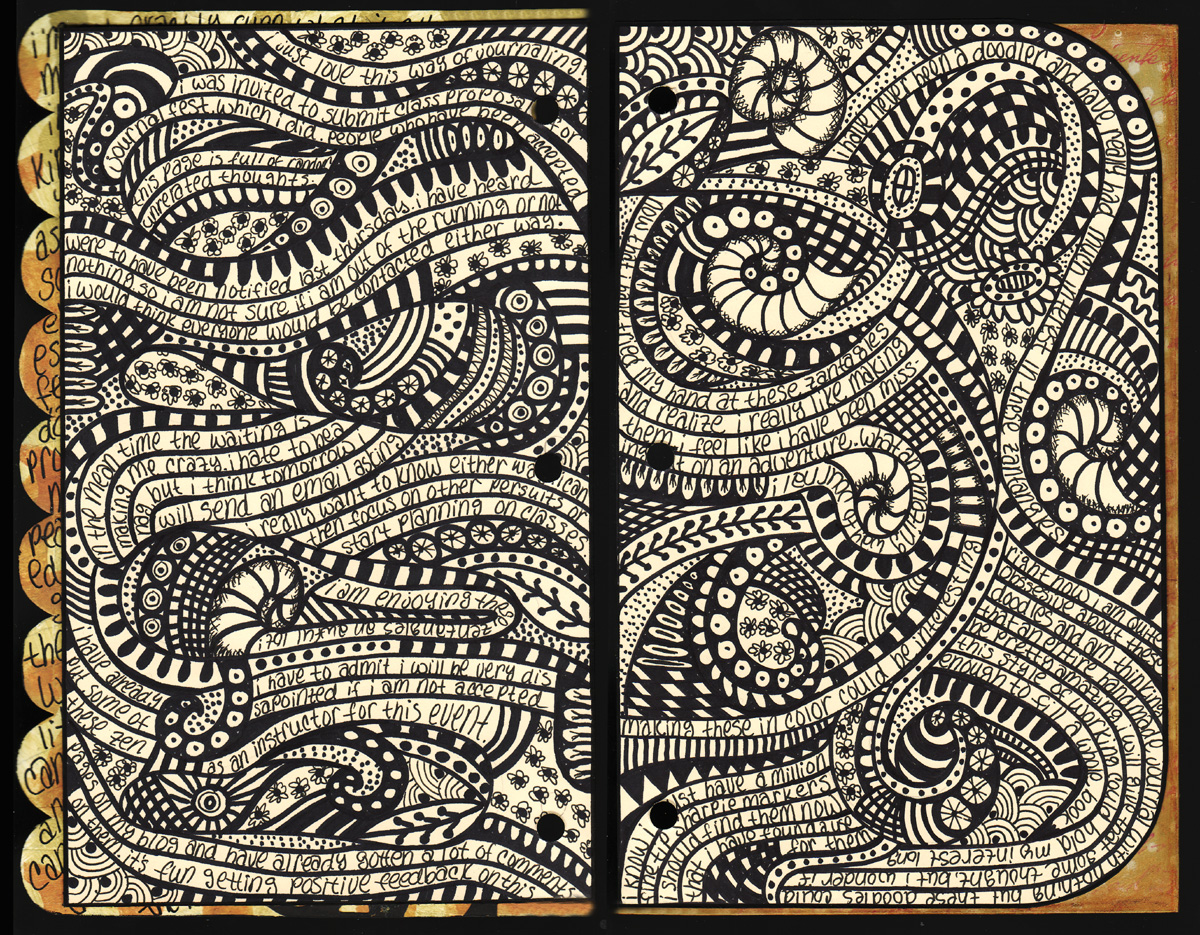
Tammy Garcia runs this great website about art journaling. If you don’t know how to get started or want to get inspired, go to Daisy Yellow. Tammy provides tons of ideas, tutorials and prompts. Here are two articles Art Journaling for Kids|Tweens|Teens and Art Journaling 101
This book published by Tara Books combines so many things I am fond of such as 1) Indian tribal painting, 2) children’s books, 3) pictograms, 4) screen printing – all wrapped into one. So I just added a new category to my blog: a wish list!
Tara is an Indian publisher producing beautiful handmade books. Watch the hand production process of this book here:
I like the way this snippet is visualized, but also the message. It applies not only to storytelling but also to art making, and is something I tell my students, but moreover to myself, again and again. Taken from here: Ira Glass on Storytelling on Vimeo
I am pretty sure as a child I used to have some books illustrated by Alain Gree, or even played with this memory game. I wished I could track them down. Looking at them just makes me happy. Read more here on Jane Foster Blog and about reprints in the Anorak magazine on grainedit.
“The Shufflebook … was sold at Museum of Modern Art’s store as a sort of (unbound) children’s book. The reader/storyteller is instructed to deal the cards that featured large illustrations and either a verb phrase (e.g., “slipped,” “got kissed”) or a noun phrase (e.g., “and my uncle”, “and 5 cows”). … The total number of the cards is 104.
The opening and closing sentence of the text on one special card says: “This is an anything book.” The text on the cover states: “There are over a million stories in this box. Shuffle the pages, lay them down and make your own story happen.” The text segments are written to combine into one very long (possibly run-on) sentence or several sentences. There is no text with capital letters and no punctuation. There are also 2 special pages with empty lines where the “storyteller” can write additional text …”
“Massimo Bartolini’s impressive green outdoor library titled Bookyardwas constructed by the artist in the idyllic vineyard of St. Peter’s Abbey in the Belgian town of Ghent. It is part of the Track art festival, and visitors are invited to take a book along in exchange for a small donation.” The first image and quote were taken from here : The Art of Reading by Kay Kremerskothen. More pictures here: Bookyard
Shame about the fact that rain and snow usually do not go well together with books. This would be my idea of paradise, a library in the middle of an orchard.
I love this idea. In the small village in Lower Austria where I like to spend the summer, there is a small disused bus shelter made of wood. I have been wondering if it could be turned into something like that – a reading shelter for the village kids, a stop for book crossing. But then it only makes sense if people use it. And that would mean more people passing through, but I like that it is so quiet here. And who would make sure it is not vandalized? Hmmm.
Here is another creative project for children, creating illustrations fo all the letters of the alphabet, with handprints. The thumbnails are a bit small but if you click on the image they will enlarge a little bit more.
I have always been interested to find out more about Otto Neurath, creator of the international picture language Isotype (International System of Typographic Picture Education)and one of the fathers of is called visual communication today. He was a central member of the Vienna Circle of philosophers. Almost a century ago, in the 1920s he started developing ideas about visualizing social facts, such as statistics on labour and economy in order to make complex ideas about social economics more accessible to all. Read more about Isotype and Neurath here and here.
Like so many other talented Austrians in the 1930s and 40s he had to leave the country ultimately escaping to Britain. He collaborated with designer Marie Reidemeister, who later became his wife Marie Neurath. Just as with other coupes – Paul and Ann Rand and Charles and Ray Eames come to mind – this seems to have been a very creative relationship. After Otto Neurath died in Oxford in 1945 Marie Neurath carried on with the work of the Isotype Institute. Otto Neurath started working on books for children in the 1940s, and the Isotype Institute under Marie Neurath produced many more books for children, notably several series of informational children’s books such as ‘Visual history of mankind’, ‘Wonders of the modern world’, ‘Visual science’, ‘The wonder world of nature’ and ‘They lived like this’. Marie Neurath’s work shows how Isotype, language and presentation can work together in reducing complexity in order to clearly comunicate ideas to children, putting ideas for visual education into practice. All materials of the Isotype Institute are now housed by Department of Typography & Graphic Communication, University of Reading.
“The books show Marie Neurath’s remarkable contributions: her ability to identify unusual relationships between things and ideas, and to analyze and then synthesize complex information into bite-sized chunks. Her approach to making child-friendly visual explanations included teamwork, consultation with readers, and iteration between experts in a particular field and those making visual decisions.” Read more here.
36 cubes to use for storytelling or as creative writing prompt. Unfortunately they are not cheap. There are similar smaller sets available from Amazon, such as three different sets of Rory’s Story Cubes with nine cubes each.
A simple and sweet idea: Rainer Hoffelner created a notebook with mostly blank pages to serve as “baby dictionary.” It is meant to be used by parents for tracking the development of their child’s language and recording original and funny expressions. It must be fun to read this book together with the child once she starts getting interested in reading and writing, talking about how much she has already learned. The child could then start noting down words by herself. Published by Langenscheidt, Germany’s most prominent publisher of dictionaries.
Sometimes I create teaching materials for primary school children. Usually they are in German, so not very interesting for this blog here. But this picture domino can be understood and used by all people who know the story of Little Red Riding Hood. The domino follows the events in the fairy tale, based on the Grimm version. The idea is, that every child has to narrate the next bit of the story, before they put the next domino piece down. Sometimes essential details have to be filled in such as the wolf devouring grandma and the little girl, but these story elements will rarely be left out anyway. So it is an exercise in sequencing and story telling. But I think it could be fun for grown ups too.
The graphics used are mostly from http://www.thenounproject.com or in the public domain. These images have been designed in the tradition of ISOTYPE and other signs, which are forming an international visual language in their own right. (Think of the signage on airports or the Olympics.) The image of Red Riding Hood is by Emma Pelling and can be found among many other educational resources at http://www.earlylearninghq.org.uk.
I am very much interested in developing Isotype-like icons for children, to be used in the context of literacy, or rather for developing multimodal literacy. I believe that abstracted and well crafted icons can be a stepping stone to alphabetic reading, as the reader has to make inferences. They also could help to communicate very efficiently to children of all languages, for example, in games or websites or other places. Of course this is happening already to some extent – children learn to read emoticons, icons and symbols in contextual menus of games. But I am sure there is more to be achieved.
The pdf is in German. The last page is meant to be a cover for a DVD storage box. I have been thinking a long time about the most practical and efficient way to store and organize learning games in the classroom. I have come to the conclusion that empty DVD covers without the DVD tray are the most simple and elegant solution. They can be stored on a bookshelf, next to books or with other DVDs, so they can be associated with both books and games. This way they can be easily retrieved and put back to where they belong. They are cheap. The boxes shut tightly, so hopefully cards and small game tokens will not be lost too quickly. The instructions can be written on the back cover and as they are protected, they will not be lost or torn. Where appropriate, a booklet or a game plan can be included (often DVD covers have little clips to hold the booklet down). For example, the story of Red Riding Hood could be provided with this game.
I am happy to borrow, steal and promote good teaching ideas and ideas for classroom organization from wherever they come from. However, I claim to be the first to use DVD covers for literacy learning boxes! Here is the printable pdf. You are free to use it. CC: BY-NC-SA


