Archive for the ‘typography’ Category
January 12, 2020
I learned from Billy Collins from this talk on Walt Whitman that Whitman designed some of the type for the first edition of Leaves of Grass, self published, printed and bound by Whitman himself.
“How poetry freed type” apparently, was 2017 a conference that explored “the ways in which Walt Whitman’s poetry and its related technologies, such as the printing press, shaped graphic design in America”.
“Letterpress technology’s rapid advances with the invention of higher-speed presses and typecasting machines gave poets cheaper access to do their own printing. This allowed avantgarde experimentation (especially the like of Parisian poet Apollinaire, and American humanists like Walt Whitman and Emerson) with typography and an ability to put pressure on word as image (rather than as music, as poetry functioned prior). by Aine Carr
Whitman keeps inspiring new generations of publishers and illustrators – here is an example: a 2014 publication of Whitman’s “Song of Myself, fully illustrated by Allen Crawford.

Posted in books, design, illustration, image, letters, poetry, typography, visual poetry | Leave a Comment »
April 18, 2014


I found these collages on my computer, but cannot find the source. Could they be by illustrator Serge Bloch?
Posted in advertising, alphabet, art, concrete poetry, design, illustration, image, letters, literacy, play, poetry, typography, visual poetry, words | Leave a Comment »
April 17, 2014

A collage a day keeps the apple at bay. I am a big fan of Martin O’Neills collage work. Here is his website: http://cutitout.co.uk/ He did an illustration series for the Guardian a few years ago, and I bought every issue just for the illustrations.
Posted in art, comic, concrete poetry, craft, design, handmade, illustration, image, letters, play, poetry, retro, typography, visual poetry, words | Leave a Comment »
April 16, 2014
Posted in advertising, alphabet, art, concrete poetry, design, digital, image, letters, sculpture, signs, typography, urban, visual poetry, words | 1 Comment »
April 15, 2014
A steady supply of emergency compliments to be used at times of great insecurity. They may come in handy sometimes. This one is for me. I always trip in front of everyone. 
Posted in design, digital, image, interweb, letters, play, procrastination, signs, typography, words | Leave a Comment »
April 12, 2014
I made these cards based on the now famous British World War poster “Keep Calm and Carry On”, which is in the public domain. You can read about the history here. Rip-offs have become something of a meme. Mail artist and brilliant typographer Keith Bates created the font, based on the original poster series.

keep calm and mail art


love respect and mail art

please do not ever feed trolls
The last one ‘please do not ever feed trolls’ may come in handy, when confronted with internet trolls appearing in internet forums. You are free to use it, whenever you feel the need.
Tags:feeding trolls, internet trolls, keep calm, love, mail art, peace
Posted in alphabet, art, design, digital, favourite word, image, interweb, letters, love, made by me, my own, play, retro, signs, typography, war, words | Leave a Comment »
April 11, 2014

Keith Bates – Rubber Stamp Mail Art. Keith Bates is a personal hero of mine. Not only is he a mail artist, but he makes beautiful fonts, including free ones, which I have been using. Check out the amazing type shop: http://www.k-type.com/
Posted in alphabet, art, design, digital, image, interweb, letters, literacy, mail art, play, poetry, retro, signs, typography, visual poetry, visualisation, visualization, words | Leave a Comment »
April 10, 2014
Posted in alphabet, art, books, handmade, image, letters, sculpture, typography, visual poetry, words | Leave a Comment »
April 3, 2014
Posted in art, books, children, garden, image, letters, literacy, mail art, maps, multimodal, play, poetry, typography, visual poetry, words | Leave a Comment »
April 2, 2014
Posted in alphabet, art, concrete poetry, image, letters, literacy, multimodal, photography, play, sculpture, typography, urban, visual poetry, words | Leave a Comment »
September 30, 2012
Posted in art, books, craft, handmade, image, literacy, love, mail art, typography, visual poetry, words | Leave a Comment »
August 28, 2012

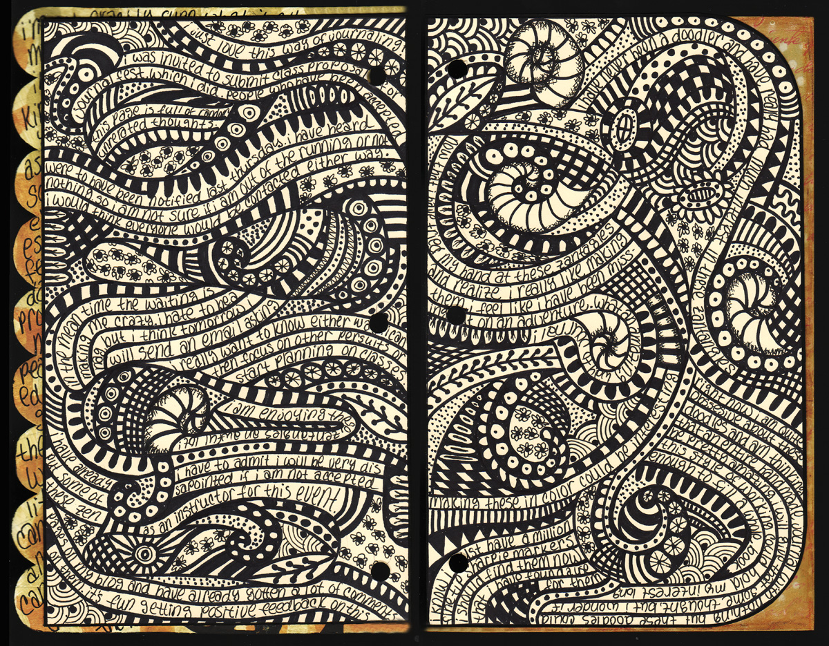
ingriddijkers.blogspot.co.at
Apparently doodling is evolving into a meditation practice called zentangle.
Posted in art, books, craft, design, handmade, illustration, image, letters, typography, visual poetry, words | 2 Comments »
August 25, 2012
Posted in art, cartoon, children, comic, comics, concrete poetry, craft, design, illustration, image, letters, poetry, retro, signs, typography, visual poetry, words | Leave a Comment »
August 21, 2012
Posted in art, books, design, image, literacy, photography, play, poetry, typography, visual poetry, words | Leave a Comment »
August 20, 2012
Posted in art, craft, design, handmade, image, letters, literacy, retro, typography, words | 2 Comments »
August 18, 2012


Printable Quotes Posters | Mr Printables.
Mr Printable offers a lovely range of mostly free (!) printable materials for children, flash cards, alphabet posters, maps. games, coloring pages, posters, paper dolls, and a small printable world to make out of paper. Very nicely designed and some very original ideas. I like these two posters too.
Posted in alphabet, children, design, digital, illustration, image, literacy, maps, play, typography | 1 Comment »
August 12, 2012
I have always been interested to find out more about Otto Neurath, creator of the international picture language Isotype (International System of Typographic Picture Education) and one of the fathers of is called visual communication today. He was a central member of the Vienna Circle of philosophers. Almost a century ago, in the 1920s he started developing ideas about visualizing social facts, such as statistics on labour and economy in order to make complex ideas about social economics more accessible to all. Read more about Isotype and Neurath here and here.
Like so many other talented Austrians in the 1930s and 40s he had to leave the country ultimately escaping to Britain. He collaborated with designer Marie Reidemeister, who later became his wife Marie Neurath. Just as with other coupes – Paul and Ann Rand and Charles and Ray Eames come to mind – this seems to have been a very creative relationship. After Otto Neurath died in Oxford in 1945 Marie Neurath carried on with the work of the Isotype Institute. Otto Neurath started working on books for children in the 1940s, and the Isotype Institute under Marie Neurath produced many more books for children, notably several series of informational children’s books such as ‘Visual history of mankind’, ‘Wonders of the modern world’, ‘Visual science’, ‘The wonder world of nature’ and ‘They lived like this’. Marie Neurath’s work shows how Isotype, language and presentation can work together in reducing complexity in order to clearly comunicate ideas to children, putting ideas for visual education into practice. All materials of the Isotype Institute are now housed by Department of Typography & Graphic Communication, University of Reading.
“The books show Marie Neurath’s remarkable contributions: her ability to identify unusual relationships between things and ideas, and to analyze and then synthesize complex information into bite-sized chunks. Her approach to making child-friendly visual explanations included teamwork, consultation with readers, and iteration between experts in a particular field and those making visual decisions.” Read more here.


Marie Neurath and the Isotype books.
Read also Austin Kleons blog post on The Simplest Expression of an Object.
Posted in books, children, design, illustration, image, letters, literacy, multimodal, research, science, typography, visualisation, visualization, war, words | Leave a Comment »