I learned from Billy Collins from this talk on Walt Whitman that Whitman designed some of the type for the first edition of Leaves of Grass, self published, printed and bound by Whitman himself.
“How poetry freed type” apparently, was 2017 a conference that explored “the ways in which Walt Whitman’s poetry and its related technologies, such as the printing press, shaped graphic design in America”.
“Letterpress technology’s rapid advances with the invention of higher-speed presses and typecasting machines gave poets cheaper access to do their own printing. This allowed avantgarde experimentation (especially the like of Parisian poet Apollinaire, and American humanists like Walt Whitman and Emerson) with typography and an ability to put pressure on word as image (rather than as music, as poetry functioned prior). by Aine Carr
Whitman keeps inspiring new generations of publishers and illustrators – here is an example: a 2014 publication of Whitman’s “Song of Myself, fully illustrated by Allen Crawford.
Tammy Garcia runs this great website about art journaling. If you don’t know how to get started or want to get inspired, go to Daisy Yellow. Tammy provides tons of ideas, tutorials and prompts. Here are two articles Art Journaling for Kids|Tweens|Teens and Art Journaling 101
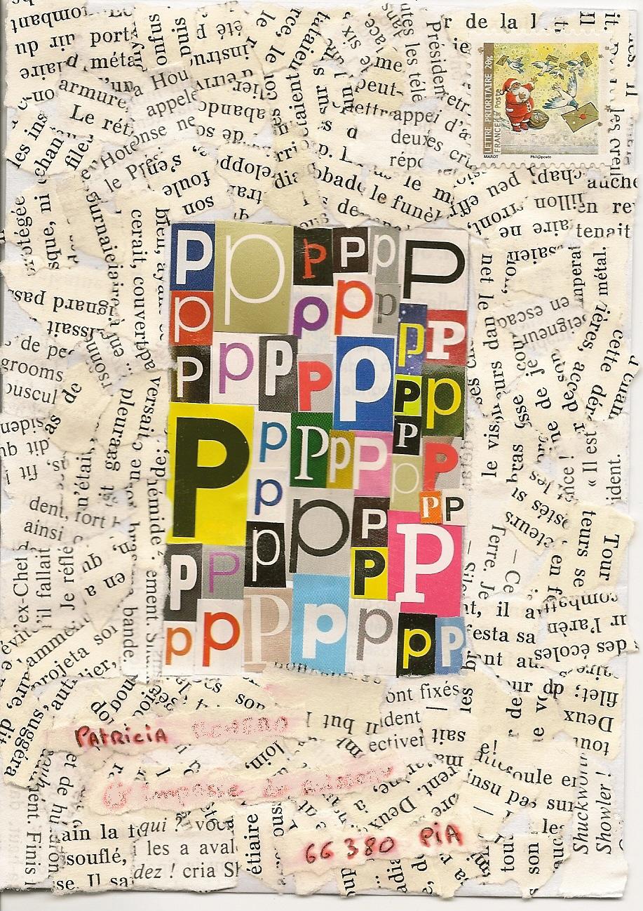
A collage a day keeps the apple at bay. I am a big fan of Martin O’Neills collage work. Here is his website: http://cutitout.co.uk/ He did an illustration series for the Guardian a few years ago, and I bought every issue just for the illustrations.
Do you think our human visual perception is pretty amazing? Think again and learn about the mighty Mantis Shrimp.
It has the most sophisticated visual system in the world, as its eyes contain 16 different types of photoreceptors (12 for color analysis, compared to humanity’s 3 cones). Mantis shrimps can thus see polarized light and 4 colors of uv light, and they may also be able to distinguish up to 100,000 colors (compared to the 10,000 seen by human beings). from swissmiss | Mantis Shrimp.
I made these cards based on the now famous British World War poster “Keep Calm and Carry On”, which is in the public domain. You can read about the history here. Rip-offs have become something of a meme. Mail artist and brilliant typographer Keith Bates created the font, based on the original poster series.
keep calm and mail art
love respect and mail art
please do not ever feed trolls
The last one ‘please do not ever feed trolls’ may come in handy, when confronted with internet trolls appearing in internet forums. You are free to use it, whenever you feel the need.
Keith Bates – Rubber Stamp Mail Art. Keith Bates is a personal hero of mine. Not only is he a mail artist, but he makes beautiful fonts, including free ones, which I have been using. Check out the amazing type shop: http://www.k-type.com/
This book published by Tara Books combines so many things I am fond of such as 1) Indian tribal painting, 2) children’s books, 3) pictograms, 4) screen printing – all wrapped into one. So I just added a new category to my blog: a wish list!
Tara is an Indian publisher producing beautiful handmade books. Watch the hand production process of this book here:
I like the way this snippet is visualized, but also the message. It applies not only to storytelling but also to art making, and is something I tell my students, but moreover to myself, again and again. Taken from here: Ira Glass on Storytelling on Vimeo
I am pretty sure as a child I used to have some books illustrated by Alain Gree, or even played with this memory game. I wished I could track them down. Looking at them just makes me happy. Read more here on Jane Foster Blog and about reprints in the Anorak magazine on grainedit.